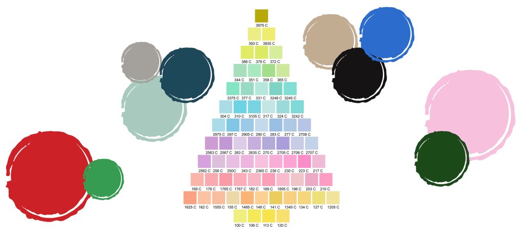
Christmas Color Palettes
Published 3:00 am Wednesday, December 7, 2022

- 1_Main_ChristmasColorPlette.jpg
You successfully traversed Thanksgiving with the in-laws and have already made the annual pilgrimage to the attic to retrieve the Christmas decorations. It’s finally time for some holiday magic!
As you sip your mocha latte from a Santa mug and assess the dusty storage bins strewn across your living room like beached whales, you suddenly realize you will literally die if you have to decorate your tree the exact same way again this year. As Bing Crosby croons that he may or may not be home for Christmas – is he mocking your discord with his deliberate evenness? – you decide this is the year things are going to change around here…starting with color!
Christmas trees aren’t the only aspect of decor that can benefit from a color pick-me-up. Consider threading a new color palette throughout your holiday design, including home decor, Christmas cards, party invitations, wrapping paper and tablescapes.
Choose Your Vibe
Before deciding exactly how your new holiday look will take shape, you’ll need to decide the general vibe you hope to convey and which color combination will best achieve that look. Is your decor style more conservative, glitzy, sleek, understated? No matter which route you choose, you’ll have plenty of palettes to express your vibe.
Traditional. When we think of traditional colors of Christmas, red and green are first to come to mind, but those colors can give off distinctly different moods depending on their hue and how they’re paired. For some fool-proof traditional color combinations, try one of these:
red + green + white
red + green + gold
red + white
red + silver
dark green + browns
earth tones
Modern. For a sleek and modern upgrade, look beyond red and green to incorporate some unexpected colors for the holidays. Combine shades of blue, purple and pink neutral tones or maybe a touch of muted gold to achieve the look. If you’re stuck, simply choose one of these color combinations for an instant change:
blues + browns
blues + grays
purple + blue
green + blue
pinks + gold
pink + white
Sophisticated. If your vibe is a little more upscale and luxe, incorporate bolder colors and pair them with metallics, earth tones, or shades of black or white.
Gather some of these palette examples together to see which one might suit your tastes:
dark green + grays + earth tones
blue + gold
black + white
black + gold
dark green + gold
red + green + orange + brown
Scroll for Inspiration
If you can’t decide what your overall vibe will be or you’re having trouble envisioning what colors will look good together, try a little graphic designer’s trick. First, do a Google Image search for “Christmas Vibe” or “Holiday Setting” or something similar. The images don’t have to be of decor or a tree; they just need to give off a holiday atmosphere.
As you scroll through the pictures, take note of which ones appeal to you. Don’t try to overanalyze why you like them; just take note. Once you’ve decided on one image that really speaks to you – really gets you in the holiday spirit – save it to your files or copy and paste it onto a document. The idea here is to be able to see the colors.
Once you have your image on the screen, focus beyond the overall image and take note of the colors in the details of the scene. Is that a dark blue? That’s unexpected. Write it down. Orange? I don’t know about that. Write it down. Once you have the most prominent three to five colors identified, you have your color palette! It’s as simple as that.


